AI Image Generation That Actually Works
I generated 100+ production assets using Google's Nano Banana models — 3D icons, character illustrations, brand badges, hero images, social cards, and OG images. Here's every technique that worked, every trap I fell into, and the two pipelines I use for everything now.
The Two Problems
AI image generation in 2026 is great at one thing and terrible at another:
Once I accepted this split, everything clicked. I stopped trying to make one tool do both jobs and built two separate pipelines:
- Nano Banana for visual assets (icons, characters, illustrations)
- HTML-to-PNG for anything with text (social cards, OG images, cover art)
Between these two pipelines, I've never needed Figma, Canva, or a designer. Let me show you exactly how each one works.
Pipeline 1: Nano Banana for Visual Assets
"Nano Banana" is Google's branding for Gemini's native image generation. Three models, one name:
| Model | ID | Best For | Speed |
|---|---|---|---|
| Nano Banana Pro | gemini-3-pro-image-preview | Quality-critical single assets. Has "Thinking" mode. | Slower |
| Nano Banana 2 | gemini-3.1-flash-image-preview | Batch work, iteration. Up to 4K, 14 refs, Search grounding. | Fast |
| Nano Banana | gemini-2.5-flash-image | Quick tests, speed-optimized. | Fastest |
I used Nano Banana 2 for 90% of work and Pro for final polished assets. Here's the workflow.
The Transparent Background Problem
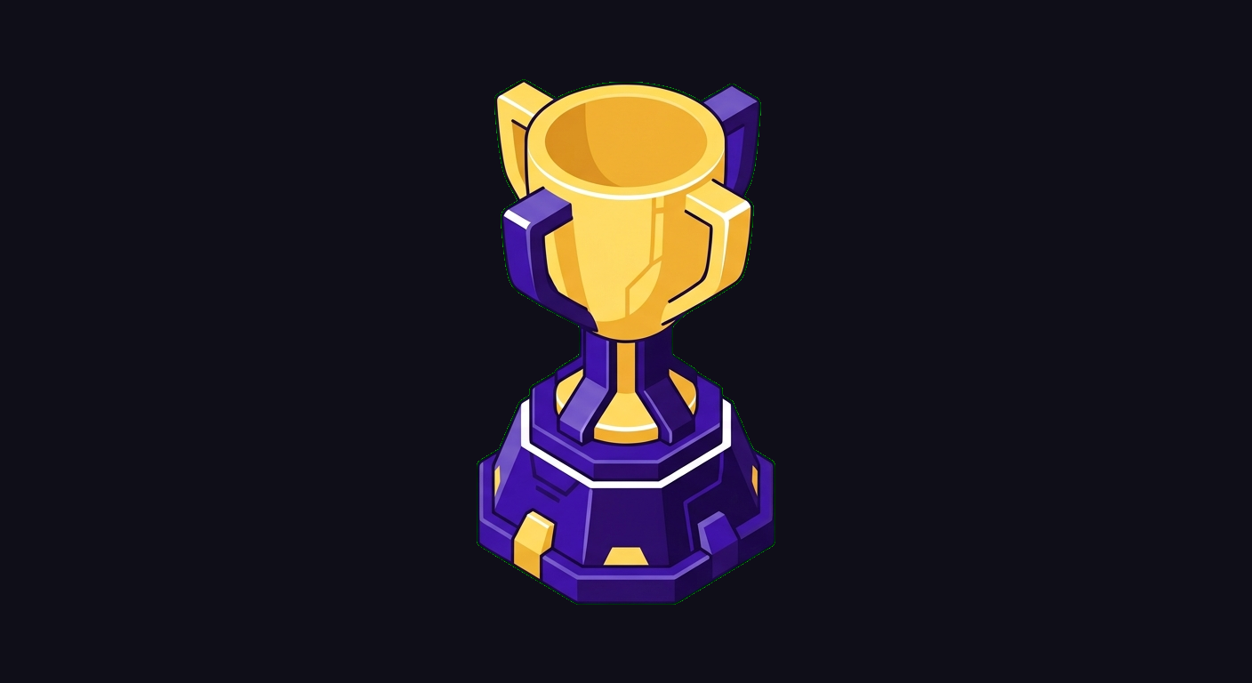
Nano Banana cannot generate transparent PNGs. Every image comes with a background. For icons, characters, and badges that need to overlay on other designs, you need transparency.
The solution: the green screen trick.
1. Prompt for a solid #00FF00 green background
2. Post-process with NumPy to detect green pixels
3. Set green pixels to alpha = 0 (transparent)
4. Anti-alias edges to prevent green fringing
Result: Clean transparent PNGs, every time.
The prompt injection is critical. Every single image prompt gets this prefix automatically:
CRITICAL: Generate the subject on a SOLID BRIGHT GREEN
(#00FF00) background. The green must be pure and uniform
— no gradients, no variation, no shadow on the green.
The ENTIRE background must be #00FF00 green with
absolutely nothing else.
And the green removal is more sophisticated than a simple color threshold. Here's the actual logic:
# Detection: HSV-like green channel dominance
is_green = (g > r + 30) & (g > b + 30) & (g > 100)

# Hard transparency on clearly green pixels
alpha[is_green] = 0

# Edge treatment: dilated mask finds boundary pixels
# Reduces green fringing, softens alpha to 0.8x
# Pulls green channel down toward red/blue average
The edge anti-aliasing is what separates this from a naive chromakey. Without it, you get cyan and yellow fringing around every edge — the classic green screen artifact that makes everything look cheap.
The Style Prefix System
Every prompt also gets a brand style injection:
Flat vector illustration style.
Color palette ONLY: deep purple (#4007AD),
golden yellow (#FFDF6B), dark purple (#260A72),
and white. No other colors.
Clean, modern, professional tech company aesthetic.
No text unless specifically requested.
This is how I maintained visual consistency across 100+ assets. Without it, each generation looks like it came from a different designer. With it, they all feel like one cohesive brand.
The Prompt Patterns That Work
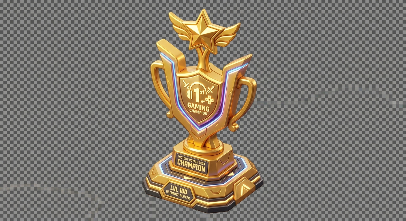
After generating dozens of assets, I found a formula that consistently produces good results:
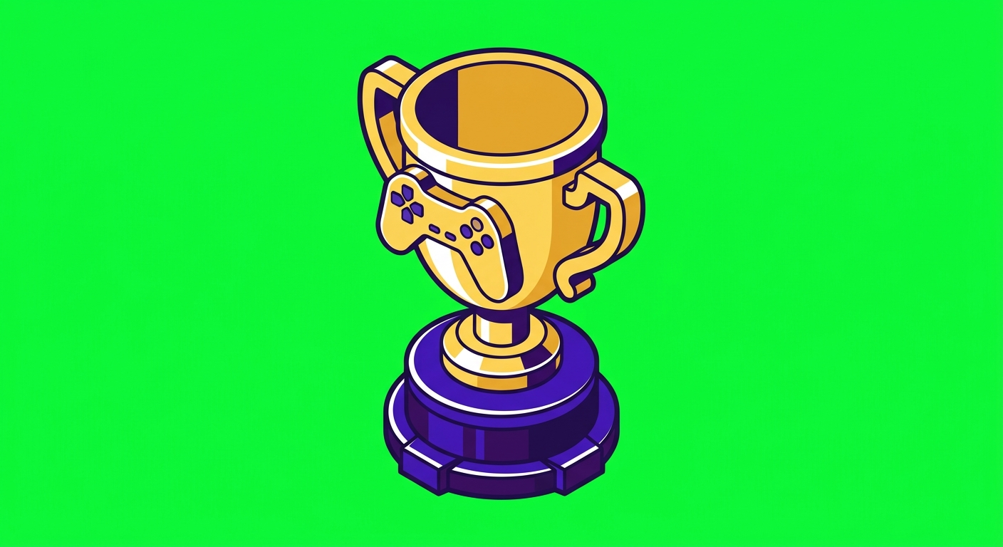
# The winning pattern for 3D icons:
"A [object], isometric 3/4 view, gaming collectible
style, glossy plastic material, just the object
floating by itself, nothing else"

# Example that shipped:
"A golden trophy, isometric 3/4 view, gaming
collectible style, glossy plastic material,
just the object floating by itself, nothing else"
The key phrases:
- "isometric 3/4 view" — consistent angle across all assets
- "gaming collectible style" — gives them that polished, tactile feel
- "glossy plastic material" — consistent material treatment
- "just the object floating by itself, nothing else" — critical. Without this, Gemini adds pedestals, frames, cards, backgrounds, sparkle borders, and other visual noise you didn't ask for
Reference Images: When to Use Them (and When Not To)
This one cost me hours. Nano Banana 2 supports up to 14 reference images (10 objects + 4 characters). Sounds great, right?
The trap: If you pass brand logo images as references, Gemini tries to reproduce the logo instead of generating the object you asked for. You ask for a trophy and get a weird morphed version of your company logo shaped vaguely like a trophy.
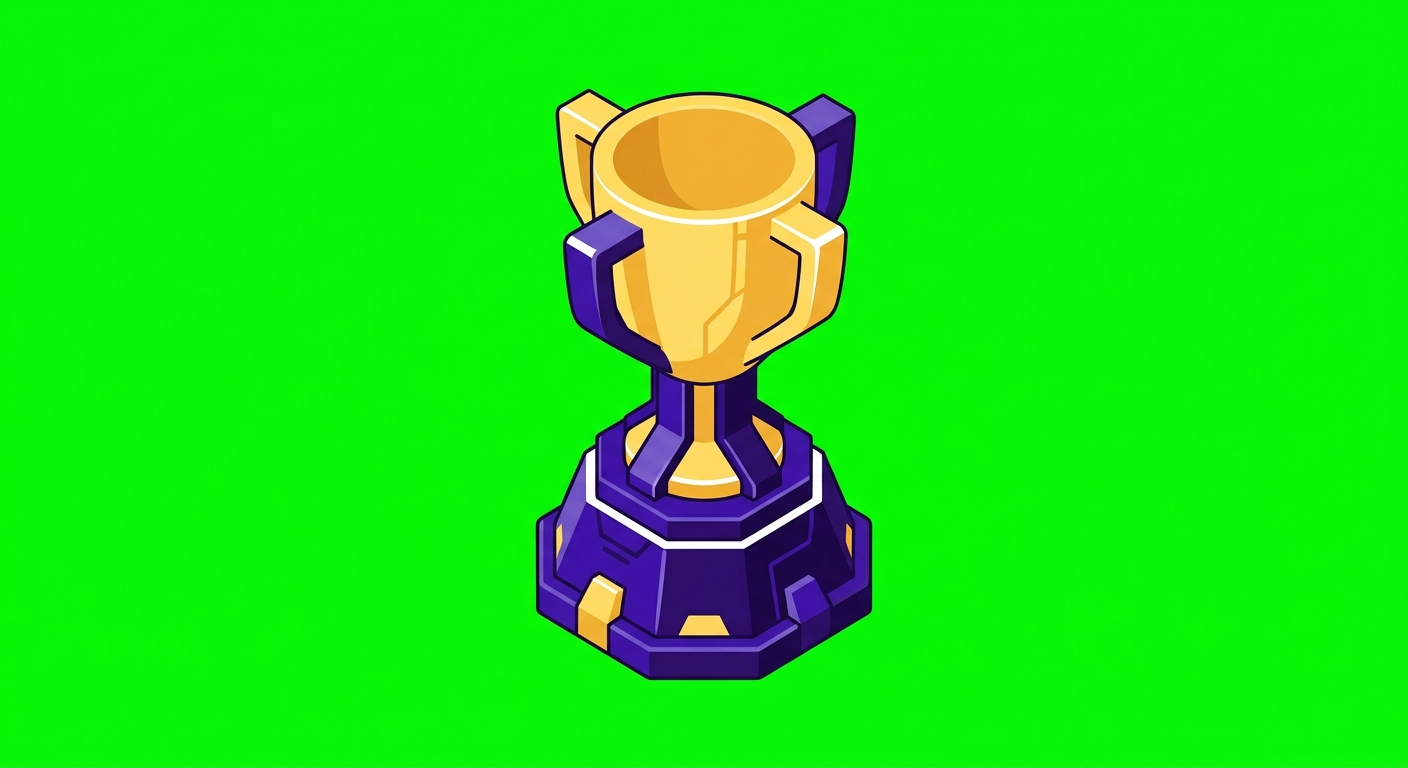
4 Style Variations I Tested
Before committing to a visual direction, I generated the same 5 assets (coin, shield, chart, handshake, trophy) in 4 different styles. This is the fastest way to explore without wasting time on full batches:
- 3D Gaming — "Glossy plastic material, soft studio lighting, isometric 3/4 view" — Won. Professional, tactile, consistent.
- Flat Modern — "Minimal design, solid colors, no gradients, no shadows, clean geometric shapes, modern SaaS style" — Too generic. Looked like every other SaaS landing page.
- Outlined — "Thin purple outline, minimal fill, white interior with yellow accents, single weight stroke" — Nice for some use cases but hard to maintain consistency at scale.
- Isometric Tech — "3/4 view, subtle grid lines, tech blueprint aesthetic, duotone purple + yellow" — Cool but niche. Only works for technical content.
Lesson: Always test 4-5 styles with the same 3-5 assets before committing to a direction. It takes 20 minutes and saves days of rework.
SVG Conversion
For simple icons that need to scale infinitely (favicons, app icons), I pipe the PNG through potrace to trace the silhouette into SVG:
brew install potrace
python3 generate_image.py -p "..." -n icon --svg
This works great for simple shapes (coins, badges, geometric icons). It does not work for complex illustrations, characters, or anything with gradients. Keep those as PNG.
Pipeline 2: HTML-to-PNG for Perfect Text
Here's the thing nobody tells you about AI image generation: use it for images, not for text.
Nano Banana Pro is better at text rendering than the older models — it can do headlines and short labels. But for anything precise (social cards, OG images, cover art, infographics), you want pixel-perfect control. And the fastest way to get pixel-perfect control is to just... write HTML.
The Technique: Puppeteer Screenshots
Write your design as an HTML page. Set the viewport to the exact dimensions you need (1200x630 for OG images, 1200x628 for LinkedIn, 1600x900 for Twitter). Screenshot it with headless Chromium. Done.
// Puppeteer + @sparticuz/chromium
const browser = await puppeteer.launch({
  args: chromium.args,
  executablePath: await chromium.executablePath()
});
const page = await browser.newPage();
await page.setViewport({ width: 1200, height: 630 });
await page.setContent(html);
await page.waitForFunction('document.fonts.ready');
const png = await page.screenshot({
  type: 'png',
  clip: { x: 0, y: 0, width: 1200, height: 630 }
});
The document.fonts.ready wait is important — without it, Google Fonts haven't loaded yet and your text renders in the system fallback font.
Why This Beats Figma for Programmatic Assets
- Templatable: One HTML template, swap the title and subtitle, generate 50 OG images. Try doing that in Figma.
- Version controlled: Your design is code. It lives in git. You can diff changes.
- Dynamic: Pull data from an API, generate the image on the fly. Social cards that update with real metrics.
- CSS is your design tool: Gradients, blur, shadows, text effects, responsive layout — you already know how to do all of this.
The OG Image Template Pattern
Here's the template I use for all my OG images and Gumroad cover art. It's a full HTML page that screenshots to exactly 1200x630:
<body style="width:1200px;height:630px;background:#08070e">
  <!-- Decorative blurred orbs -->
  <div class="glow"
    style="background:rgba(124,58,237,.15)"></div>

  <!-- Geometric SVG lines (low opacity) -->
  <svg style="opacity:.06">
    <line x1="600" y1="0" x2="0" y2="630" />
  </svg>

  <!-- Content -->
  <div class="badge">MCP Memory Server</div>
  <h1>Brain Kit</h1>
  <p>Your tagline here.</p>
  <div class="features">
    <span>Feature 1</span>
    <span>Feature 2</span>
  </div>

  <!-- AI-generated image on the right -->
  <img src="brain.png" />

  <!-- Bottom bar -->
  <div class="bottom-bar">
    <span>dashbuilds.dev</span>
    <span>$29</span>
  </div>
</body>
The trick: combine both pipelines. Generate the hero illustration with Nano Banana (transparent PNG via green screen), then embed it in the HTML template alongside pixel-perfect text. Screenshot the whole thing. Best of both worlds.
Client-Side Fallback: html2canvas
For in-browser image generation (social media dashboards, live previews), I use html2canvas as a fallback when Puppeteer isn't available:
// Inline external images + fonts as data URLs first
// Create hidden iframe with full HTML
// Render at 2x scale for retina
const canvas = await html2canvas(element, { scale: 2 });
canvas.toBlob((blob) => {
  // Download or upload the PNG
});
The key gotcha: you need to inline all external resources (Google Fonts, images) as data URLs before rendering. html2canvas can't fetch cross-origin resources.
The Hybrid: AI Images + HTML Templates
The real power move is combining both pipelines. Here's what my production workflow looks like:
- Generate visual assets with Nano Banana (3D icons, illustrations, characters) using the green screen trick for transparency
- Design layouts in HTML with CSS (text, spacing, brand colors, gradients)
- Embed the AI assets into the HTML template as
<img>tags - Screenshot the combined result with Puppeteer
This gives you AI-generated creative with pixel-perfect text and layout. The AI handles what it's good at (visual creativity), and HTML handles what it's good at (text, precision, consistency).
I use this for:
- Gumroad cover art: AI-generated brain illustration + HTML text + radial gradient mask to blend the watercolor into a dark background
- Social cards: AI-generated icons + HTML layout with platform-specific dimensions (LinkedIn 1200x628, Twitter 1600x900, etc.)
- OG images: AI-generated hero image + branded HTML template with feature badges
The Prompt Mistakes (And What They Produce)
Every technique above was learned by getting it wrong first. Here's what each mistake looks like — the bad prompt vs the fix, with real Nano Banana outputs:
Asked for "transparent" — got a literal checkerboard
Green screen trick — clean, removable
Actual output with "white outline" in prompt — flat white border, no depth
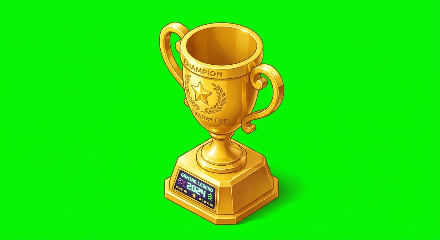
No "floating by itself" — got pedestal, garbled text, extra elements
With "floating by itself" — clean, isolated, brand colors
The full pipeline result: green screen → NumPy removal → transparent PNG
→
Green screen removed with NumPy + edge anti-aliasing. Ready for HTML composition.
10 Lessons from 100+ Assets
1. "No text unless specifically requested"
Add this to every prompt. Without it, Nano Banana will cheerfully add garbled text labels, watermarks, or random words to your image. Even if you didn't mention text at all.
2. Never say "white outline"
I had "white outline" in my style prefix for weeks. It caused literal white borders and dark background cards behind every object. Removing those two words fixed dozens of broken generations.
3. "Just the object floating by itself, nothing else"
This is the most important phrase in icon generation. Without it, Gemini adds pedestals, display cases, frames, sparkle borders, and background elements you never asked for.
4. Test styles before committing
Generate the same 5 objects in 4 different styles. 20 minutes. This saves you from generating 50 assets in a style that doesn't work and having to redo everything.
5. Skip brand logos as references for simple objects
Gemini will try to morph your logo into the shape you asked for. Use references only for complex illustrations where style consistency matters more than accuracy.
6. Use Pro for heroes, Flash for everything else
Nano Banana Pro's "Thinking" mode genuinely produces better results for complex compositions (characters, scenes, multi-element layouts). For simple icons and badges, Flash is indistinguishable and 3x faster.
7. The green must be pre-set, not prompted
If you're feeding images to Veo for animation, pre-composite the character on green with PIL before sending to Veo. Prompting Veo for "green screen background" starts black for ~1 second, ruining chromakey. (More on this in my Veo 3.1 post.)
8. Edge anti-aliasing is non-negotiable
A simple "if green, make transparent" produces awful edges. You need a dilated mask that finds boundary pixels and softens them. The extra 10 lines of NumPy code save every single image.
9. HTML-to-PNG is underrated
Everyone's chasing AI-generated text rendering. Meanwhile, a 60-line HTML template + Puppeteer produces perfect text at any resolution, in any font, with any layout. Use AI for the creative parts, HTML for the precise parts.
10. Trim Veo character animations to 2.5 seconds
If you're animating characters: Veo morphs faces and arms after ~3 seconds. Loop a 2.5-second trim and it looks like an intentional idle animation.
The Toolkit
| Task | Tool | Why |
|---|---|---|
| 3D icons, badges, coins | Nano Banana 2 + green screen | Fast, consistent with style prefix |
| Hero illustrations, characters | Nano Banana Pro + references | Thinking mode for complex compositions |
| Style exploration | Nano Banana 2 (4-5 variations) | Fast iteration before committing |
| OG images, social cards | HTML + Puppeteer | Perfect text, templatable, version controlled |
| Cover art, marketing images | Nano Banana + HTML (hybrid) | AI illustration embedded in HTML layout |
| Simple icon SVGs | Nano Banana + potrace | Scalable vectors from AI-generated shapes |
| In-browser image generation | html2canvas (2x scale) | Client-side fallback, no server needed |
| Character animation | Nano Banana → PIL → Veo → ffmpeg | Green screen pipeline for animated overlays |
The Bottom Line
Stop trying to make AI generate text. Stop fighting Canva for programmatic assets. Stop paying a designer for social cards you need 50 of.
The split is simple: Nano Banana for creative visuals, HTML-to-PNG for text and layouts, and the hybrid approach when you need both. This combination replaced my entire creative toolchain — 100+ assets, zero design tools, zero dollars spent on design.
"Did you make these? They look like they came from a design agency."
— a colleague, looking at assets I generated during a lunch break
The design agency is a Python script, a green screen trick, and an HTML template. That's the whole secret.
Brain Kit ($29)
Never lose a working prompt again. Brain Kit gives your AI tools persistent memory — capture image generation settings, style preferences, and workflows with semantic search.
Get Brain Kit — $29Like what I build? Check out the shop — deploy-ready kits starting at $14.
More AI production guides
This post covers images. For AI video production (Veo 3.1, Remotion, ElevenLabs, extension chaining), read the companion post.
Read the Veo 3.1 guide